As we mentioned in our previous post, we've been thinking about our image a lot lately. At the moment, it's difficult for us to put new designs in place. It's even harder for us to keep everything consistent. This has led to lots of differences between our website, blog, and apps.
We decided we needed to do something about this.
For the past few weeks, @georgkrause, @sporiff, and @mjourdan have been hard at work on a solution. After some trials and tribulations, we finally have something to show you. In fact, you've most likely noticed it already!
Stop teasing me! What's the solution?
Allow me to introduce Funkwhale UI! A brand new central repository for Funkwhale design components built using Bulma.
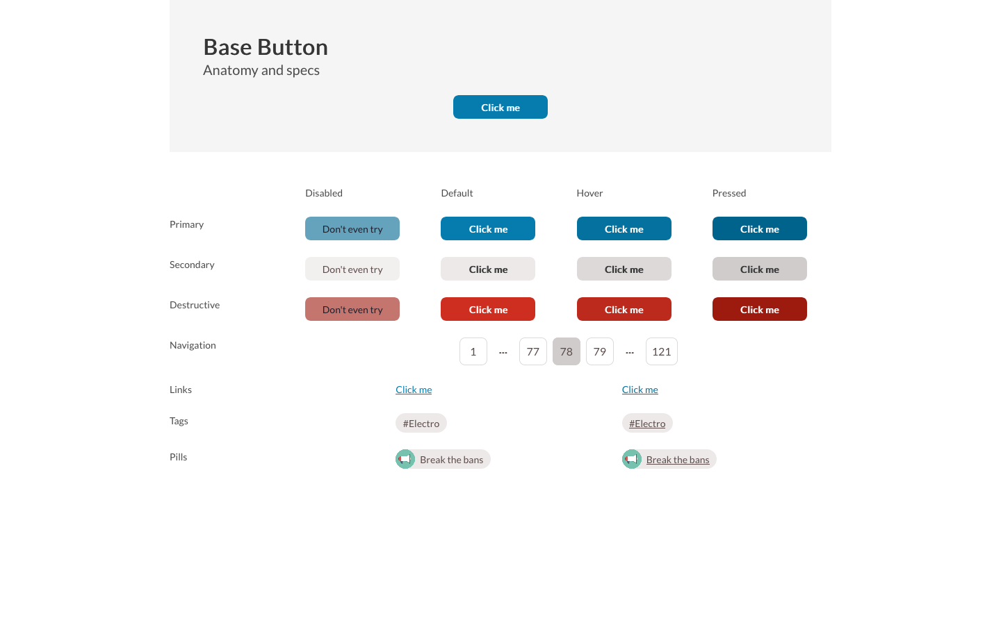
The idea behind this solution is it enables us to work on design ideas in steps. Designers can submit changes to components, colors, and anything else they want to. Developers can then work out the CSS and update the components in the UI library. This generates an NPM package and stylesheet that we can import into our projects. Nifty, huh?
Check out the project repository, or see a preview of the current elements!
Awesome! What did you mean I've noticed it already?
Our guinea pig for this stylesheet is the blog you're reading right now! We decided to take some of our initial designs and start replacing bits of this blog. The most important thing to replace was our pagination bar. In the old blog design this was… weird, to say the least. Now we have a proper pagination element with real aria labelling!
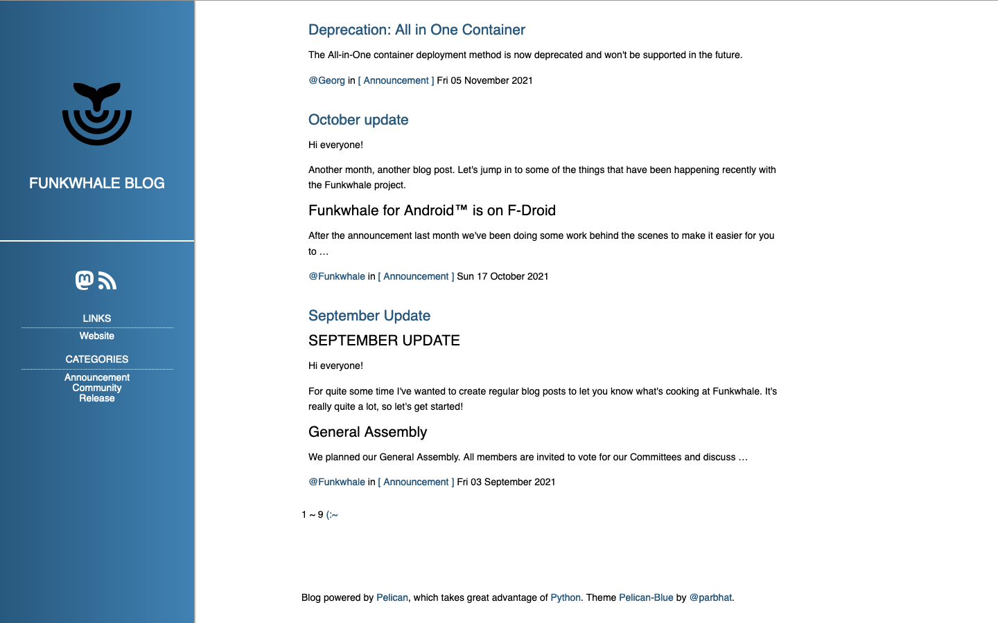
Before
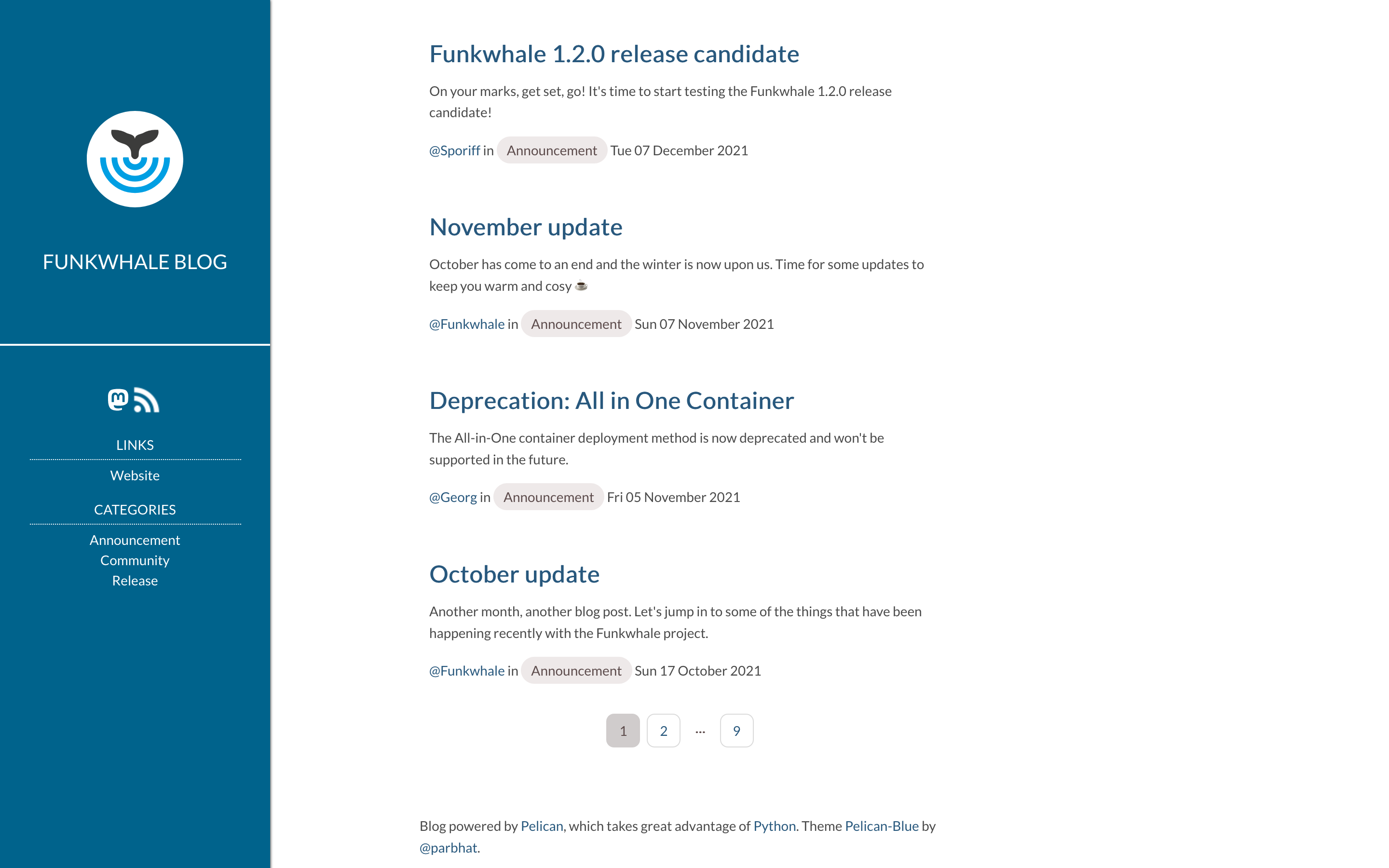
After
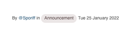
Another element you might have noticed is the new category tags. We built these using an updated design for tags found in the Funkwhale app.
We've also applied consistent text styling across the blog. To show this off, we've gone through the whole blog to fix formatting and broken links.
Great! So… what does this mean?
This project enables us to work a lot faster on new designs. We can create and test the UI elements before adding them somewhere. We can also make changes with ease by updating the package version or stylesheet version. This means we can make sweeping changes with little disruption.
It also means we can create a consistent design voice for all parts of our project. Currently everything looks different, but we can work towards a real Funkwhale "look".
Want to get involved? Head on over to our forum and let's get the conversation started!