Hello there!
We're currently working on (among other things) a fresh new design for funkwhale.audio. At the end of this post we'll tell how you can help, but first we'll discuss the why and how.
Why the changes?
If you're here you've probably already visited funkwhale.audio at least once, so you know this is the website the Funkwhale community runs to represent the project. It's also the entry point to find how to start using Funkwhale, get help, reach to the community, or contribute in the many possible ways.
The initial motivation to work on this was mainly technical: we wanted to make the site easier to maintain in the long run. In parallel, we already wanted the same for the Funkwhale app itself. So we're making changes both on the visible side and under-the-hood, that should tighten up things altogether.
We could have made a purely technical update and no one would have noticed any changes. Ok, maybe that would have changed a button style here, a font over there, a few other visual changes and that would be it. But while we were at it, this sounded the right time to address the grievances we had with the website, but had never treated as a priority. There are indeed a few issues we have identified, and we'll tell you in this post what we plan to do to solve them.
Better framing of project goals
As stated above, funkwhale.audio is intended to give a clear view of what Funkwhale is, what are its benefits, what features does it sport, and ultimately who controls it. The first thing people see when visiting funkwhale.audio is that huge description:
A social platform to enjoy and share music
A social platform. Possibly not the best introduction to Funkwhale. Not that it is dishonest, or factually wrong: as a community project Funkwhale is really a social thing. But because it creates false expectations. Indeed, with that wording, people may think of features like microblogging, chat or comments, none of which have been implemented as of now. And with it being emphasized as the shortest description of Funkwhale, some may expect these features to be the core of Funkwhale.
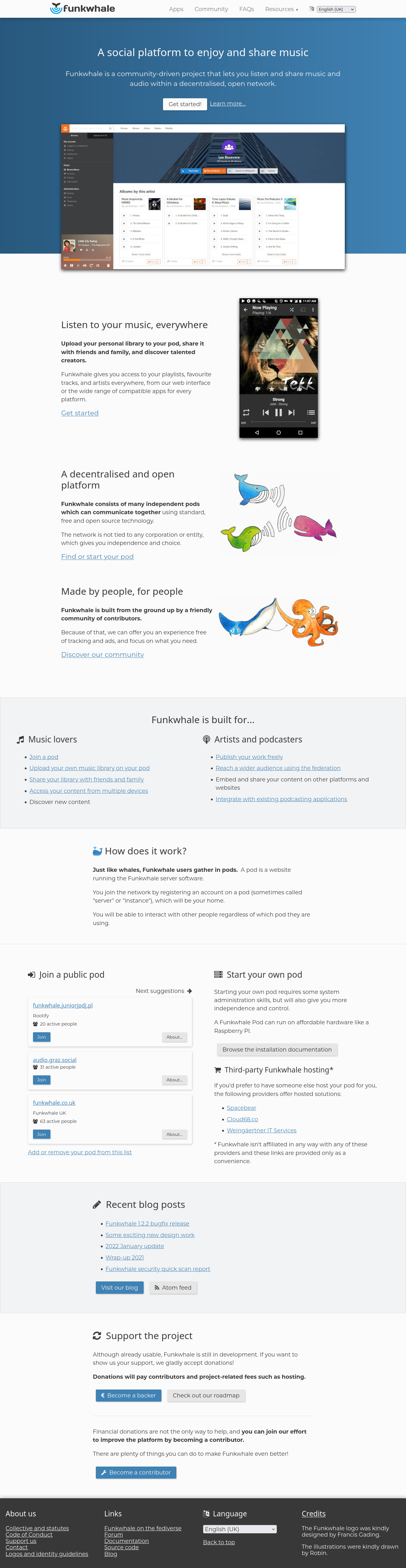
Apart from the description, the most prominent thing visitors will find on funkwhale.audio is a screenshot of the app. This one is outdated, and we have been asked a few times how was it possible to get this cool blurry player in the sidebar? The (not so) sad truth is that is was removed months ago in favor of a bottom bar, expandable into a full-page player.
A picture being worth more than a thousand words, here is the old landing page:
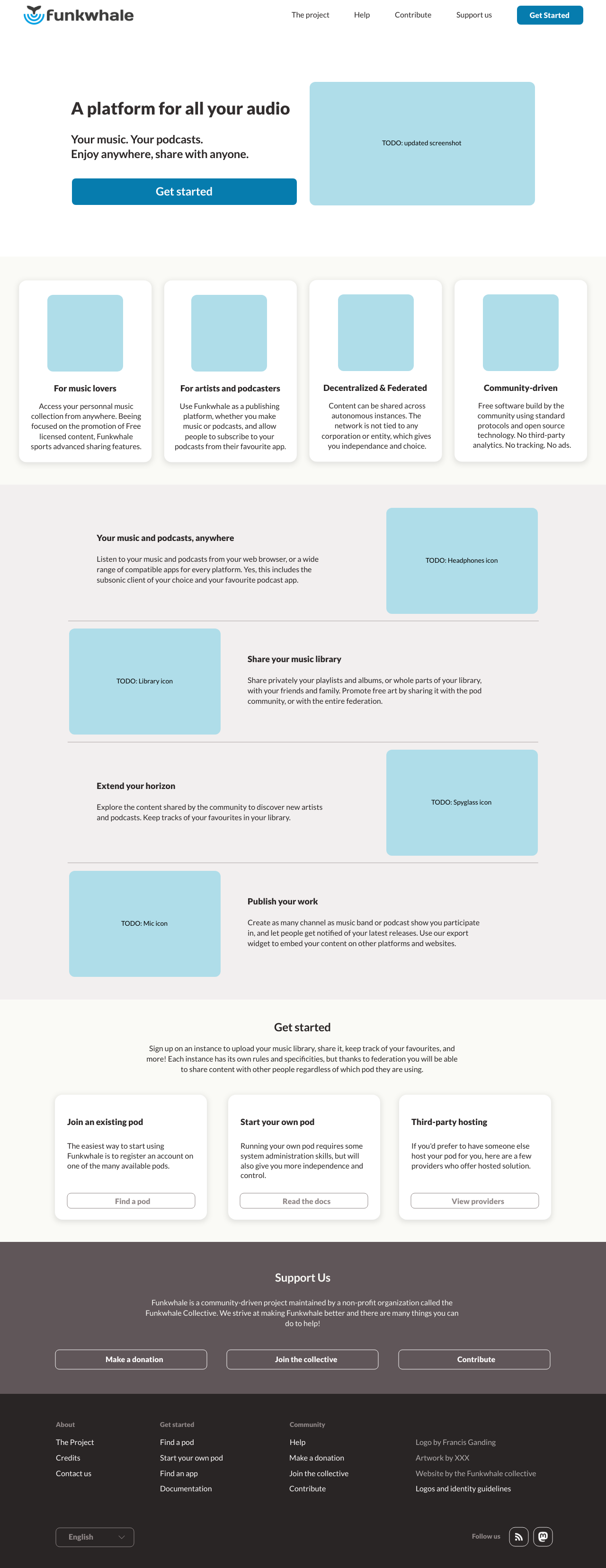
And here is our mockup, with a more accurate description of Funkwhale, the benefits it brings, and its features:
More focused pages
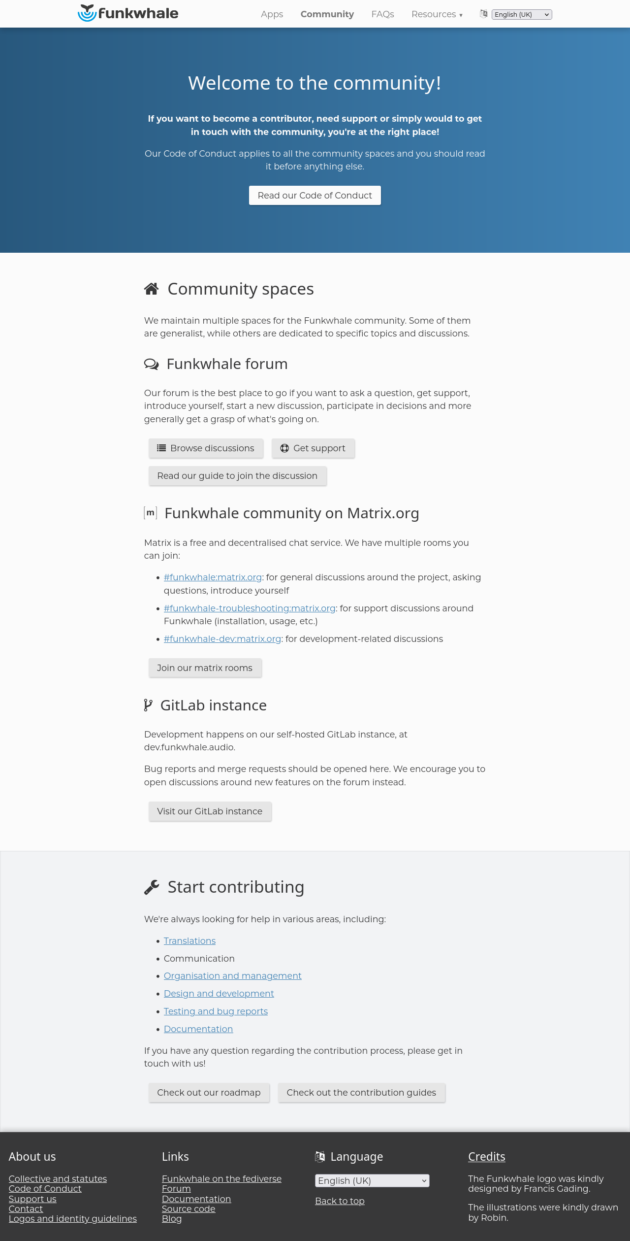
Probably because of the importance given to the social dimension of the project, the website has a whole "community" page. This page is mainly about communication tools (that can be used for very different purposes) and how to contribute. But it also has, disseminated on the page, a couple of links to request help.
Everyone comes to the community with their problems and interests, and those can change over time. It's true: when you are struggling with something, maybe it's not the best time to encourage you to contribute to other topics.
So we revisited the page to better distinguish between topics.
Current version, the "community" page, covering two different things:
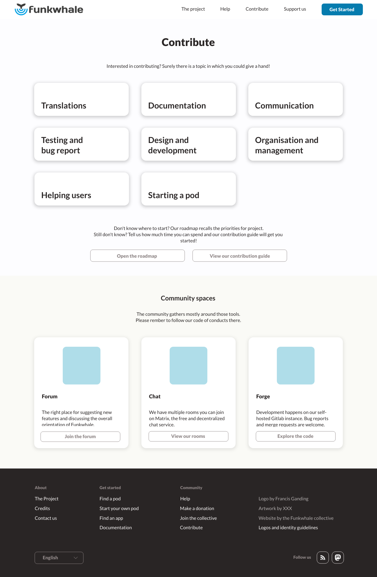
Mockup, a new page with a clear focus on contribution:
Finding help
What about when people encounter issues? Just sending them straight through to the community spaces didn't feel like the right thing to do. They would rather have access to the resources that are relevant to them, so maybe they could better understand the situation and solve their problem.
This is the time where the documentation would come in handy, thus we wanted to give it the prominent place it deserves. Visitors could find the section they need, without being overwhelmed by an endless bullet list as is the case today.
Current version, a link in the footer sends us right through a separate site, with an endless bullet list
Mockup, a dedicated page on funkwhale.audio gives a clean overview of all the available resources
In parallel, a huge amount of work has been done on the documentation part, and we expect the overall experience of looking for information to be much nicer soon.
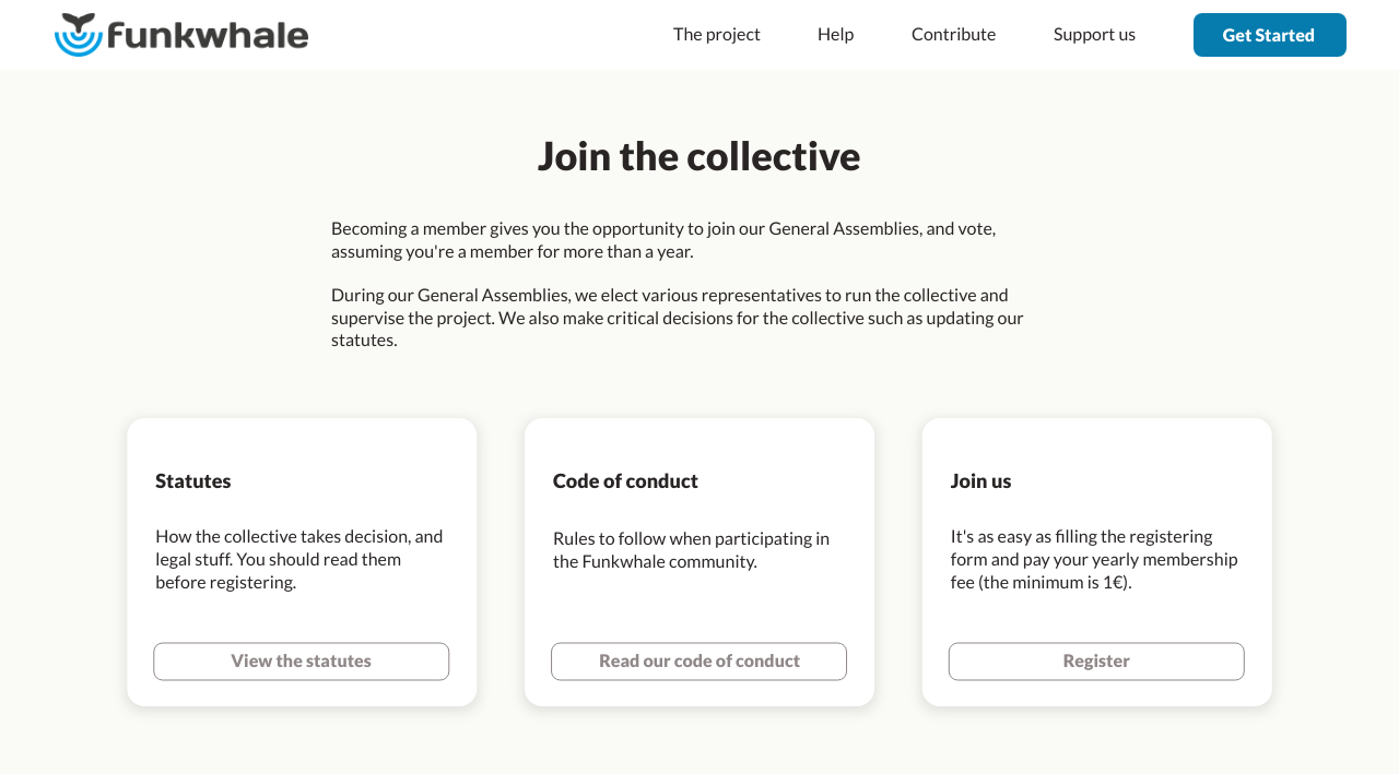
Members onboarding
One thing we revisited is the process to become a member of the Funkwhale Collective. The process could be confusing in some circumstances, at least it was an issue for me when I applied to the Funkwhale Collective, but it appeared maybe I wasn't the first one. So we want to make sure people who are willing to join the Funkwhale Collective could safely travel towards the membership form, without falling in the trap of the donations form.
Current version, joining the collective is in the middle of donations means and expenses:
Mockup, joining the collective has its own page, and it's more about involvement and collective decisions:
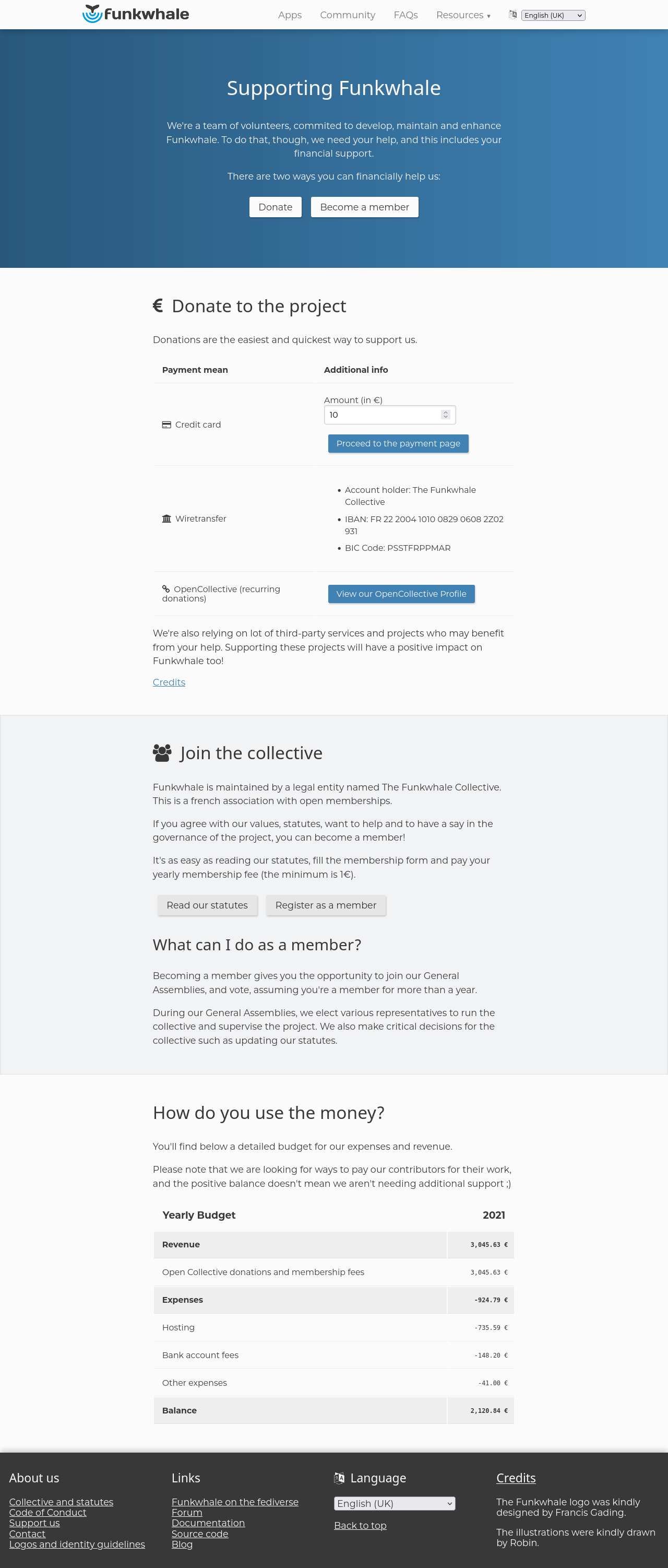
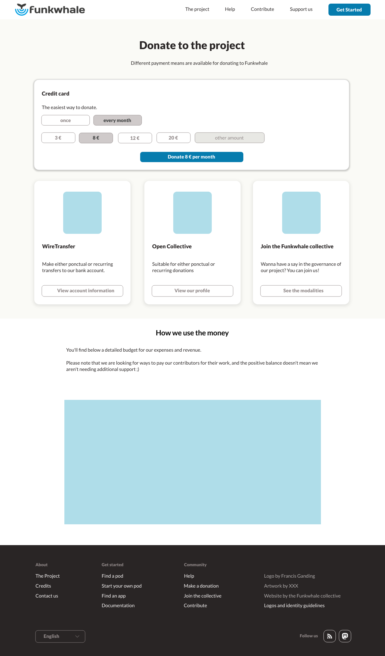
Donation form
Speaking of the donation form, we plan to make slight adjustments to it. We take donations on a pay-what-you-want model, and we have our "Support us" page. There, we have an input field where one could enter whatever feels right to them, and it comes with a pre-filled value of 10€. Not everyone values Funkwhale the same, and not everyone have the same resources. If 10€ is pre-filled, is it ok to give less? So we're thinking of suggesting a few amounts in addition to the free form, so that donators can better decide how much they are willing to give.
Also, we could well be accepting credit card donations on a monthly basis. Donators wouldn't have to worry about when their last donation was, and if now is the right time to heat up the credit card. This would bring the credit card on par with the other payment means (wire transfer and Open Collective), as those already allow for recurring donations.
Current version, let's take a look again at the screenshot of the donation form. We'll see that donations have three payment methods, "call to action" for two of them, a single amount:
Mockup, multiple amounts suggested, a single action emphasized, possibility for monthly donations, hints to choose the most appropriate payment method
Things not covered yet
One other thing we wanted to improve was the instance recommendations. We're yet to provide an effective solution for this, so maybe this will be the subject of a future post.
Since we started working on the website redesign, the steering committee has had some discussions about how we could reduce the administrative tasks burdening our beloved maintainer Georg, while encouraging the community involvement on the project direction. The Funkwhale Collective will have to discuss this, and ultimately take decisions which may impact the redesign. There has been very little discussion so far. If you have hopes or concerns for the future of the Funkwhale association, please consider sharing your thoughts while there's still time.
How to help
Thanks for reading this far! Maybe you would like to participate in the effort? There are plenty of things to do!
- Illustrations: funkwhale.audio features two lovely drawings by Robin. The new website could use a bigger set of images, with transparent background to bring some visual sweetness.
- Translations: many parts of the website being rewritten, new translations will be needed.